Journal #Eight [PRJ701] - Data Analytics
![Journal #Eight [PRJ701] - Data Analytics](/assets/images/prj701-j8.jpg)
Data Analytics
JOURNAL #EIGHT [PRJ701]
Data Analytics
Data Team Sprint Demo
The data team demo included a presentation of the extracted sales platform data that had been loaded into the Snowflake data warehouse solution and subsequently transformed by DBT. The objective of the fortnightly sprint was to visualise meaningful data analytics which was presented in two business intelligence solutions, Tableau and Qlik.
The data for the analytics was run first in Snowflake using a simple SQL query selecting year, month and the sum of sales grouped by year and month to produce year on year monthly revenue figures. The query was expanded to include the region so stakeholders could identify the best performing regions year on year.
Business Intelligence
Tableau is an industry-leading tool and this is reflected in its ease of use and integration. The requirement to install a local application to connect data sources is not a preferred solution given the availability of cloud service providers and the benefits of a complete cloud solution. In addition, the connection to Snowflake required a driver that had to be installed through the Snowflake account, again this should be avoidable and unnecessary given the integration methods deployed by the competition. However, once the data connection had been established analytics can be performed in the cloud environment.
The visualisations in Tableau are incredibly easy to create and this is where the product started to sell itself. Knowledge of SQL made creating analytics a quick process simply copying the code directly from Snowflake to create the data selections and produce charts for revenue by year and month and total revenue by year and month.
Qlik is a different proposition, the integration was simpler being an entirely cloud-based solution that better meets the wider IT infrastructure strategy. However, creating the visualisation was not successful, at this stage in the sprint it was unclear where or how SQL could be utilised to speed up the process instead of having to rely on the interface which has a level of complexity that is suspected to match the tool’s capabilities. Qlik appears to be a powerful tool, what it attempts to offer in capability though removes some of the users control to manipulate the data.
To gain a better understanding a technical meeting was arranged to understand how the package functioned as an ‘associative engine’ and not a SQL engine, the details of which are explained in this journal.
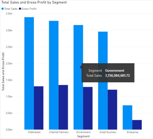
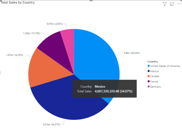
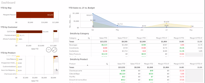
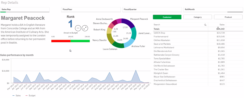
The below images are visualisation that represents close facsimiles of the actual business data, these have been created from publicly available test data in Microsoft Power BI.
Problems Encountered
There are areas of the data architecture that require further development, namely the extraction tool Stitch. It is unclear if the extraction and load to Snowflake are occurring at the half-hourly intervals throughout the day, with the most current information dated from several days before the demo meeting, it was verified in the meeting that there should be newer data listed in Snowflake.
The revenue data previewed in the meeting related solely to one-off sales, reoccurring sales data was not included due to the limitation of the sales platform to record these types of sales. There was insufficient time in this sprint to resolve the issue, however, solutions were discussed including a structural rethinking of the products offered and the wider sales model, which would impact positively on the data collection effort.
The visuals in Qlik were not completely representative of the data available in Snowflake. The data available in Snowflake, and represented in Tableau, was from January 2020 to date, however, Qlik only identified data from August 2020 and included a column in the chart for August 2019. It is not clear what process is causing the problem.
Goals
There are several clear goals for the data team in the forthcoming sprint:
- Make a final decision on a BI tool, market leaders vs. cost
- Understand how the data visualisation are updated when new data is ingested into Snowflake
- How can the visualisation be presented, slides and office displays
- Create data alerts/notifications in the BI tools for given conditions
- Create visualisation that stakeholders can access on mobile devices
- Verify the integrity of the data in Snowflake and Tableau to gain confidence in the system
- Integrate the data studio dashboard in the BI tool environment
- Formulate a plan to ingest reoccurring revenue data into the existing sales and revenue data
Qlik Demonstration
As stated, part of the fortnightly roadmap is to make a final decision on which business intelligence tool to deploy across the growing organisation. To accelerate the process further, testing has taken place on actual business data in Tableau and Qlik. Unlike Tableau, Qlik is more the wildcard choice that warrants further investigation. A meeting was held with the sales and technical team to gain further insights.
The key sales points or benefits of Qlik is its associative engine and the entirely cloud-based approach to providing data analytic services.
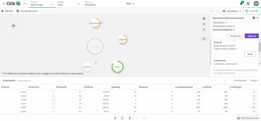
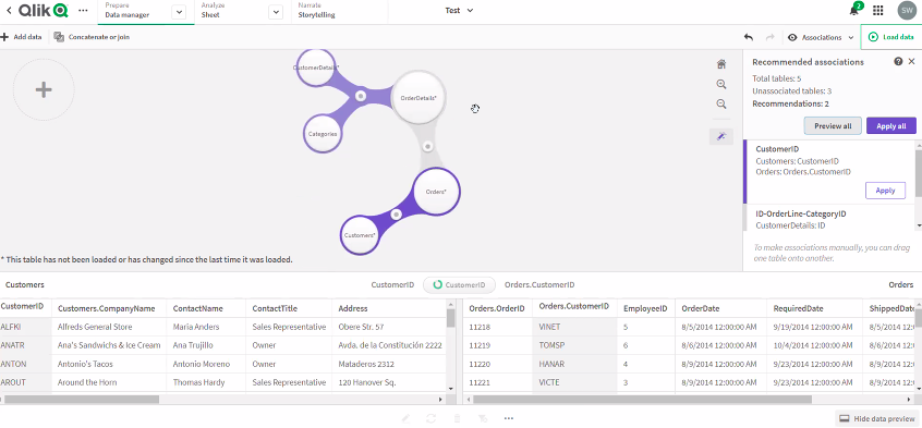
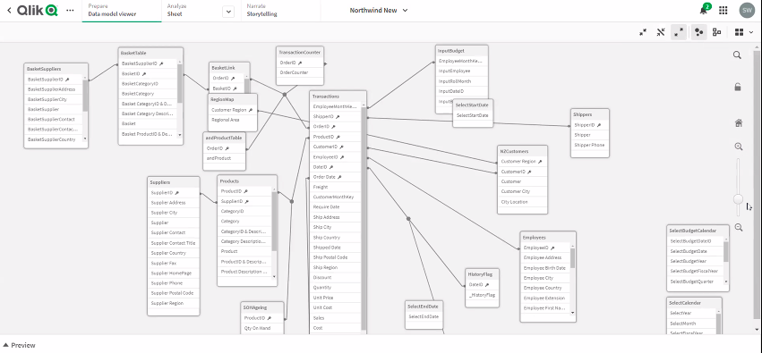
The associative approach is used to grab data from tables and identify foreign key relationships to create data collections through the associations. The data model viewer extracts and adapts tables and rebuilds them in-memory, meaning there is no need to build the hierarchy, Qlik Sense AI is intelligent enough to make the associations. The associative engine doesn’t rely on table headers to make these associations, instead, it scans the tables to identify the relationships from the tuples and makes a connection.
This is not a perfect process and where errors are uncovered they can be corrected by pointing the association to the right data set. Once the selections are made the data can be narrowed further through cataloguing it into spaces. The following images show the associations identified by the program and indicate the number of common fields identified, more tables can be added and linked together. The associative engine could be a useful tool for organisations that don’t have the technical capability to build a data warehouse but needs to connect disparate data sources from across the business.
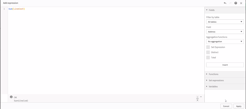
Once the data is loaded into Qlik master measures are formulas are created by developers and deployed in the analytics as required by the end-users. These measures are simple calculations on the data much in the same way sums can be used against data sets in Microsoft Excel, they support the enforcement of consistency and accuracy of the aggregated values across the analytics being produced.
The measures allow the data to be analysed. There are two ways to do this, either through ‘insight’, which allow natural language inputs that work to varying degrees of success or with the creation of sheets. Sheets allow data to be manipulated with the drag and drop of dimensions and measures allowing the system to be used by non-coders such as business stakeholders. Qlik will auto decide what visualisations work best, these can be amended and new visualisation created by the user.
Qlik Features
- Create apps that allow for the mobile display of data
- Colours and layouts are fully customisable
- Scale graphs so more info can fit into a smaller space
- Click through several auto-generated screens to view different analytics
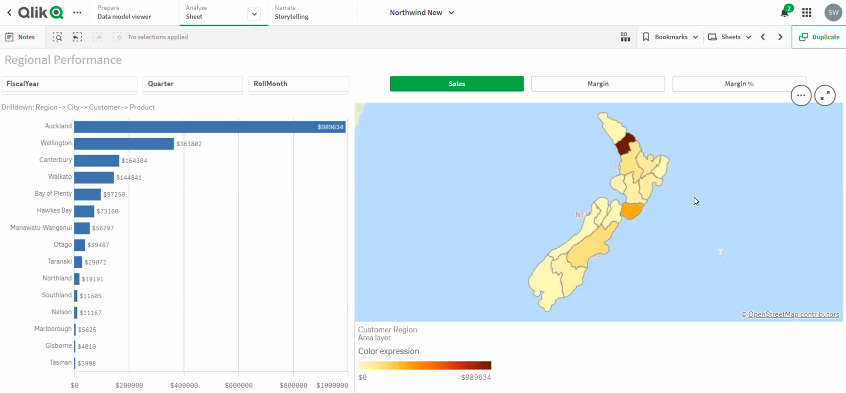
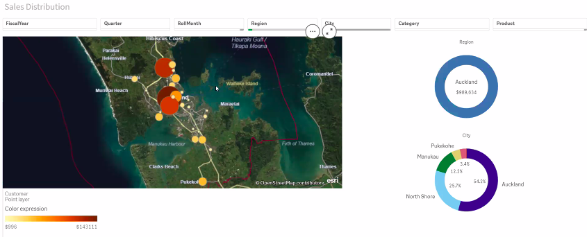
- Regional density maps to display highest-selling geolocation for figures total
- If the address is included in the data set Qlik calculates longitude and latitude and the map can be narrowed to the specific location
- Filters are built into every sheet and when selected they auto adjust every visualisation
- Measures and dimensions are stored in-memory to increase the speed results are returned
- Data refresh is dependent on the size of the data, for close to real-time information it is better to fetch only the data necessary rather than the entire database
- Larger data refresh on the complete data set in the collection is best performed overnight so it doesn’t affect business processes
Snowflake. (n.d.). Retrieved September 16, 2021, from https://help.tableau.com/current/pro/desktop/en-us/examples_snowflake.htm