Journal #Seven [DES501] - Web Design: HTML, CCS, Grids
![Journal #Seven [DES501] - Web Design: HTML, CCS, Grids](/assets/images/DES501-J7.jpeg)
Web Design: HTML, CCS, Grids
JOURNAL #SEVEN [DES501]
Web Design: HTML, CCS, Grids
The following HTML and CSS form part of the exercise projects available on Dash. Project 1 and 2 have been completed and screenshots are located in this journal.
HTML
| HTML | Description |
|---|---|
< !DOCTYPE html > |
This declaration provides information to the browser about the document type. |
< head > |
This is a container element for data about the document, this metadata is not displayed on the web page. |
< title > |
This element contains the title of the web page and is displayed in the title bar of the web browser. |
< style > |
This is a tag that is used for the style information (CSS) for the web page content in the body. |
< body > |
This is used to define the body of the document, it contains all the visible web page contents such as images, paragraphs, tables, links, etc. |
< h1 > |
Defines a large heading on the web page, extends to < h7 >. |
< p > |
Defines a paragraph on the web page. |
< article > |
Defines self-contained content that is independent from other content in the body. |
< img src =" " > |
This allows for a image to be embedded on a web page. |
< input type > |
Used to define an input field, these can be numerous types including "button", "text", "email", "radio", etc. |
< placeholder > |
Used to give a hint as to the expected value of an input being passed into a field. |
< link href=" " rel=" " > |
Provides a link that imports a style sheet to the html document. |
< button > |
Creates a visible button on the web page. |
< ul > |
Creates an unordered, bulleted list. |
< li > |
Used in conjunction with the ul tag to form the unordered list. |
CSS Properties
| CSS | Description |
|---|---|
text-align: center; |
Sets the alignment of text on the horizontal axis, can be right, left, justified or centered. |
background-color: white; |
This property that sets the background colour of an element, including border and padding, but excludes the margin. |
background-size: cover; |
This property is used to specify the size of background images. |
color: black; |
This is used to specific predefined colours, that can be described in this example or RGB, HSL, RGBA, HEX, etc. |
font-family: helvetica; |
The property is used to specify the font within an element, several font names can be included and used as a fallback if the browser doesn't support the first font. |
padding: 100px; |
The padding property is used to pad the space between the content and its border. This property has four values for top, right, bottom, left, in that order. |
display: block; |
This property is used to specify an elements display property. |
font-size: 40px; |
Used to set the size of the text, this should not be used to make adjustments to text size to make it headings. |
background: url(" "); |
Sets an image as the web page background. |
margin: 40px 0px 0px 0px; |
This property is used to set an elements margins, the four values include top, right, bottom, and left, in that order. |
border: 7px solid white; |
This is used to specify a border width and colour. |
border-radius: 20px; |
This property is used to define the radius of the corners of an element. |
max-width: 500px; |
This allows the element to support smaller browser windows, it is useful to make the element compatible with smaller devices. |
@media |
This is a rule in CSS that is used in media queries that allows different styles to apply to different media types or devices. This is particularly useful to deliver tailored style sheets for responsive web pages. |
CSS Grids
CSS grid layouts are used to create two-dimensional grids to format web pages into their major areas and smaller interfaces.
Grids are made up of horizontal and vertical intersecting lines that create columns and rows on a web page. This makes it easier for web designers to design web pages without having to manage floats and the positioning of elements that make up the page content.
Grids in CCS have various features such as:
Fixed & flexible track sizes: Creation of grids with track sizes that
are fixed, pixels can be used to define the layout. Flexible sizes can be
created using percentages or the “fr” unit.
Item placement: Items can be placed accurately into their location.
Content held in additional tracks: Ability to add rows and columns to
add other features such as columns that fit inside a container.
Alignment control: Ability to control the alignment of content after
it is placed inside a grid.
Overlapping content control: Numerous items can be placed in a grid and
they can partially overlap one another, the layering can be controlled with
the z-index property.
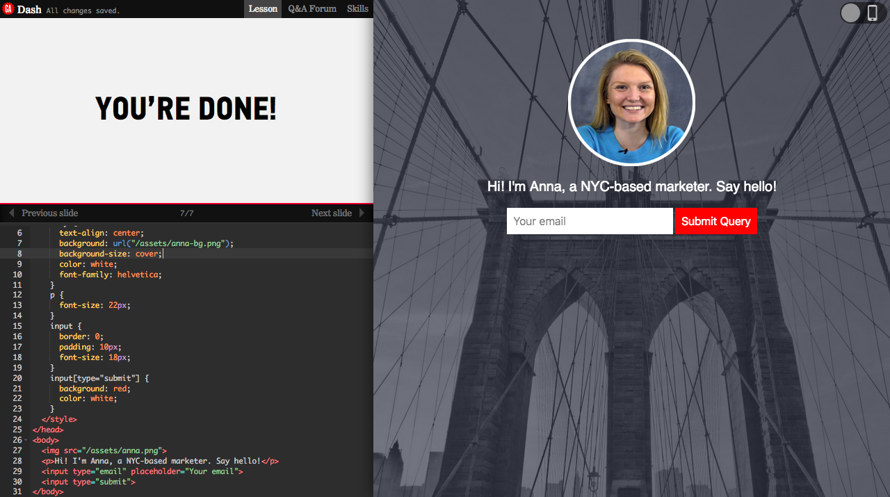
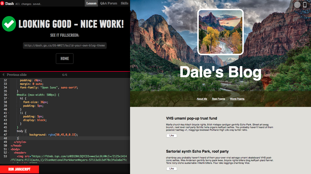
Activity Screenshots
The following are screenshots of the HTML and CSS activities in Dash:
Project 1: Build a personal website
Project 2: Build a responsive blog theme
References
Basic Concepts of grid layout - CSS: Cascading Style Sheets - MDN. (n.d.). Retrieved May 6, 2021, from https://developer.mozilla.org/en-US/docs/Web/CSS/CSS_Grid_Layout/Basic_Concepts_of_Grid_Layout
Learn to code HTML, CSS, and JavaScript with Dash. (n.d.). Retrieved May 6, 2021, from https://dash.generalassemb.ly/projects
W3Schools Online Web Tutorials. (n.d.). Retrieved May 6, 2021, from https://www.w3schools.com/default.asp