Journal #Six [DES501] - User Experience Concepts
![Journal #Six [DES501] - User Experience Concepts](/assets/images/DES501-J6.jpeg)
User Experience Concepts
JOURNAL #SIX [DES501]
User Experience Concepts
This journal is going to explore some of the concepts and tools that are used by designers to help produce better project outcomes, that more successfully meet the needs and requirements of stakeholders and users.
Wireframes vs Mockup vs Prototype
Wireframing, creating mockups, and prototyping are all valuable tools that can be deployed by UX and UI designers, however, it is not always clear how they can be best used to develop better designs.
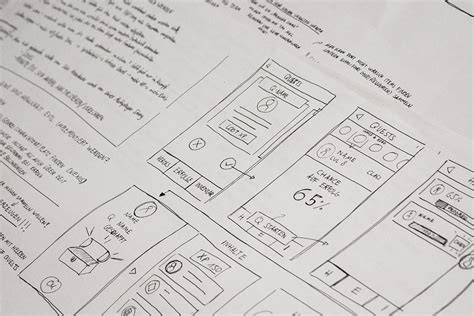
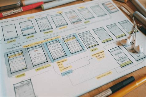
Wireframes
Wireframes are extremely useful in web development, supporting UX designers by offering a visual understanding of a webpage and showing how the product will come together before significant work is undertaken, this allows for changes to be made without causing a detrimental impact to the budget or timeframe.
Often wireframes are created on paper and do not require any complex software packages. They are described as simple, rough sketches of how a website or mobile app will look, with elements of the design represented by grey pencil lines, boxes placeholders and sometimes colour. The framework of wireframes is skeletal and the purpose is to show the main page content, structural outline and basic UI.
Wireframes and other similar tools can be created in two ways:
| Low fidelity | High fidelity |
|---|---|
| Created on paper or simple designer tools | Created using professional designer tools |
| Show major parts of web app and are static | Include more details and simple interactions |
| Show basic content | Visualise simple process flows |
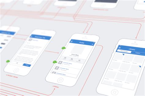
Mockup
A mockup can be thought of as a more realistic impression of how the website will look, taking the wireframe as a blueprint. This can be particularly useful for business users who can use mockups to more effectively communicate their thoughts, discuss specific options or ideas, and more successfully collaborate with the design team.
Whereas wireframes are made up of grey lines and boxes, mockups offer a far richer experience through the use of added visual details including:
- Colours, style options, graphical elements and typography suggestions
- Buttons and text that are specifically relevant
- A content layout that features the accurate spacing of components
- Graphics that support the web app navigation
Not every user involved in the project development will be able to imaging the final product when looking at wireframes, this is where mockups are particularly useful. They also aid designers through the ease at which the impression of the final product can be reviewed, tested and iterated.
Prototype
Prototypes can be considered as a fully interactive and functional mockup that includes interactions and animations, in effect it acts as if it is the final product. Prototyping is used by designers to produce a realistic view of the product and conduct useability testing to find errors, which can reduce cost and save time.
Prototyping is particularly useful to:
- Obtain feedback from end-users to determine if requirements are being met
- Test for problems and identify potential problems
- Identify opportunities to improve the design
- Attract more stakeholders and users into the process
Generally, mockups are high-fidelity creations, prototypes on the other hand can be generated either as low-fidelity or high-fidelity interactions. Unlike low-fidelity wireframes, prototypes are more realistic and will include more in the way of colours, interactions and elements to help visualise the design.
High-fidelity prototypes contain high-quality visuals, content and interactions and will take advantage of a professional prototyping tool. This allows it to act as though it is the final product, without the need of creating expensive code or requiring a development team.
Pain Points
Pain points are used to describe a moment in the user experience that causes one or more of the following emotions or reactions:
- Frustration
- Discomfort
- Irritation
- Hassle
Pain points are identified through the journey mapping process. This process emulates a real experience path of a user, and the decisions they must make as they interact with the system being developed. Understanding where these pain points occur, particularly those considered ‘high’, that may force a user to leave the app, should be understood and steps taken to mitigate the occurrence.
Isolating and analysing pain points is a valuable step in improving the user experience and developing better-designed products. Even relatively small adjustments in the design to improve the journey can have a significant impact.
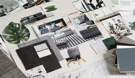
Mood Board
Mood boards are an important part of the design process, they are used by UX designers to convey a feeling and impression about the product to be developed. Often a colour palette, textures, shapes, text and images can be agreed through the creation of a mood board, which then act as a reference point throughout the development process.
To create a mood board designers need to research and find images, shapes, colours and fonts that will resonate with the users of the system. Understanding the business that the product is being created for is extremely helpful to ensure the right message is being delivered.
Mood boards can grow to include sound or video depending on the audience and can be physical or digital. Any method is acceptable as long as it effectively portrays the ideas and inspiration for the project.
References
Mockplus. (n.d.). Retrieved April 16, 2021, from https://www.mockplus.com/blog/post/wireframe-mockup-prototype-selection-of-prototyping-tools
Schicker, E. (2020, October 26). Journey-mapping pain points & success moments in UX research. Medium. https://blog.prototypr.io/journey-mapping-pain-points-success-moments-ac2d6cbcafae
What is a Mood board? How to Use Mood Boards in UX Design. (2020, February 6). FreeCodeCamp.Org. https://www.freecodecamp.org/news/what-is-a-moodboard/