Journal #Five [DAT701] - Analytics & Insights
![Journal #Five [DAT701] - Analytics & Insights](/assets/images/dat701-j5.jpg)
Analytics & Insights
JOURNAL #FIVE [DAT701]
Analytics & Insights
Power BI Dashboard
The dashboards in Power BI are constructed with the information from the two views created in the data warehouse. In the assignment documentation, this task would be split between the data warehouse developer and business analyst. The developer, having relevant permissions would create the view in SQL server, allowing the business analysts to make the connection in Power BI. Depending on the technical skill level of the business analyst, the data warehouse developer may need to make this connection on the business analysts behalf, before handing it over to the analyst to generate meaningful business insights.
The dashboards make use of charts, colours, and headings that allow a stakeholder to easily digest the information that has been made available. Best practices and standardisation have been deployed across all the dashboard views. High level and more important information are grouped in the top left of the dashboard, which is where the eye naturally looks. Colour is used to theme the dashboards and make the visualisations easier to view and understand. Headings are in grey so they can be used as a reference point, without distracting from the business information that is displayed that uses a prominent blue. If possible, an interview of stakeholders would be conducted to understand what information in the dashboard is of key importance, it may be the case that a particular region, segment, or sales team are under particular scrutiny or marked for anticipated growth, these key areas could be highlighted in blue, with the other information in various shades of grey so that the key areas of importance stand out and can be found at a glance.
Sales Performance against KPI
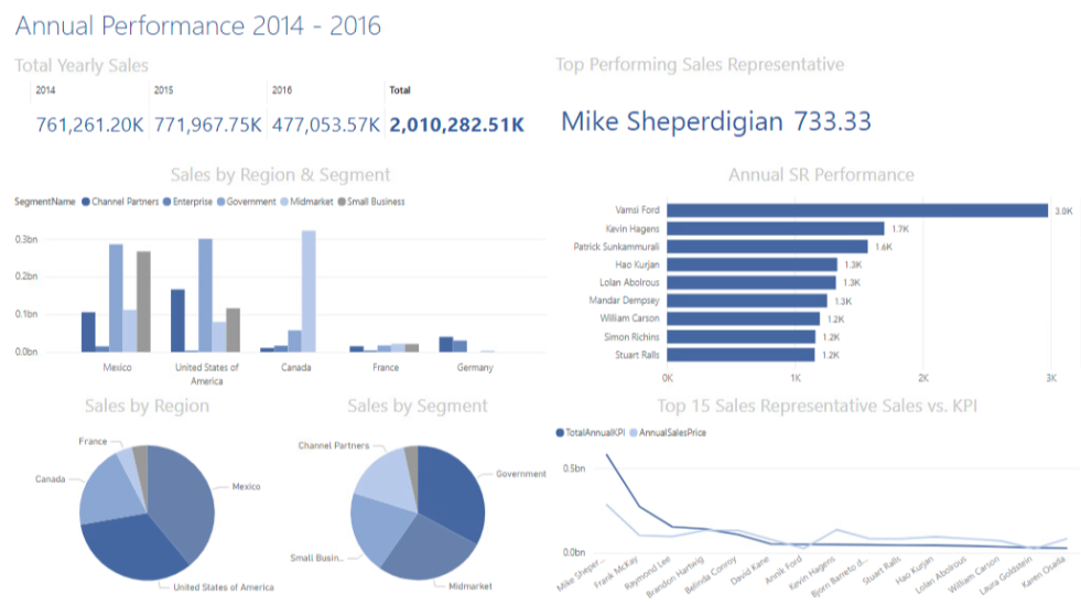
View 1 has been used to create the dashboard displayed in Figure 24, this relates to the sales performance section of Assignment 1 and is set to the year granularity level. A view could also be generated to provide monthly granularity, however, a determination has been made that this would not provide reliable results to business stakeholders given that the KPIs are set for sales representatives annually. This would lead to misleading figures, for example, if a monthly granularity level was produced it would be the annual KPI divided by 12 months, evenly split, with no consideration to monthly variances experienced by all businesses. For example, in the hospitality industry, revenue increases dramatically in the summer months and around Christmas time, but are far lower in the late autumn and new year, comparing this with an even split KPI would not only be unfair to the sales representatives but would be misleading for business stakeholders.
To create a valuable dashboard for business stakeholders given the quality of the data available, a comparative set of analysis visualisation has been produced. This includes total yearly sales for covering the current financial year, and the previous two financial years, which includes the top- performing sales representative as high-level business information. Additional charts are available that provide a finer grain, allowing stakeholders to view a greater level of detail, including the:
- grouping of sales by region and segment combined
- grouping of sales by region and segment as splits in pie chart format to easily view where sales are generated
- sales representative (SR) performance
- sales against KPIs by sales representative
Tooltips are available to perform a deeper dive into the detail in the charts, showing the colour key and additional information.
Sales Orders
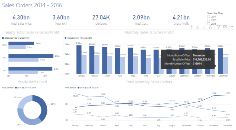
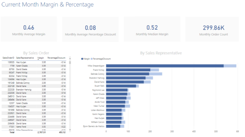
View 2 has been used to create the dashboard in Figure 25 relating to sales orders covering the current and preceding two financial years, with granularity to the month level. Figure 26 collates the annual information for a top-level view of the total sales and gross profit, items sold, and sales orders. The collated monthly figures cover each of the three financial years. The dashboard includes a filter that allows users to drill down the years to select an individual year. Tooltips are available to provide specific information on certain areas of the chart. Figure 26 uses the same view and relates to the most recent months total margin and total percentage.
The main purpose of the view is to provide the most valuable sales order data for stakeholders as cards across the top of the dashboard, these headline figures are easier to read and digest. The bold text differentiated with the colourway makes the figures stand out, this data can be viewed quickly and on the fly, the charts provide a more detailed overview of the company’s orders where required.
Monthly Margin & Percentage
Figure 26 has been produced to meet the business question relating to margin and discount asked in Assignment 1. The dashboard shows the average margin, percentage discount, and median margin for the most recent month in the data set, being December 2016. Figures are produced for high-level stakeholders that need quick and easy access to the data. Additionally, the dashboard provides a detailed list of sales orders for the month, the sales representative attached to the order, and the margin and percentage discount for that order. A more user-friendly bar chart has been provided showing the margin produced by sales representative, and the percentage discount applied for the month across sales orders generated.
maggiesMSFT. (n.d.). Create a Power BI dashboard from a report—Power BI. Retrieved November 6, 2021, from https://docs.microsoft.com/en-us/power-bi/create-reports/service-dashboard-create